
Marketing Psychology and Consumer Behaviour
How does an incomplete image or art give viewer the sense of closure for its message or idea?
Why does our mind get tricked to fill in the gaps in the visual perception?
How do Brand use Principle of Closure and Continuity in their Logos and Visual Ads?
Principle of Closure

Closure is the instinct to organize pieces of sensory input into a complete image or feeling. If we perceive that a stimulus is incomplete, we are compelled to figure out its complete meaning; we consciously or subconsciously fill in the missing pieces.
Tweet
The Principle of Closure is literally about drawing conclusions. We humans are very adept at drawing conclusions from less-than-all the information. This is the Power of Our Subconscious Mind. If the full understanding of a promotional message requires completion and some mental effort, consumers are likely to take the time to figure out its meaning in order to achieve closure.
Examples of Closure:
1. Asking consumers to unscramble words
2. Showing pictures and asking consumers to name the activities or items shown
3. Including sentences with missing words and asking consumers to fill in the blanks
4. Asking consumers to match, for instance, occupations with people shown wearing different styles of clothes
5. Showing incomplete pictures so that consumers imagine the complete picture.
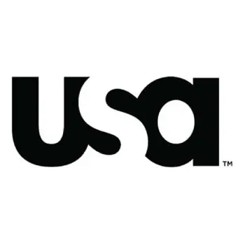
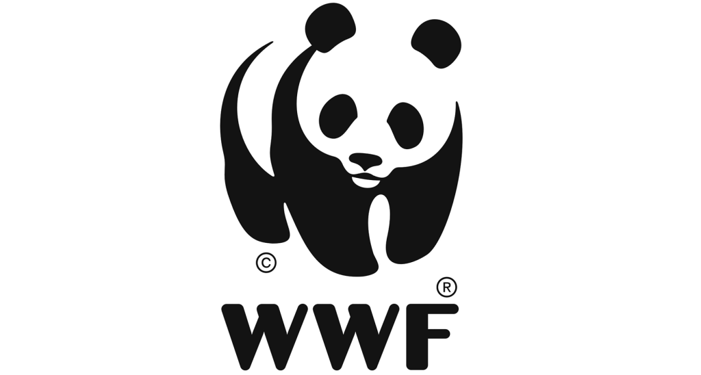
In the above image, did your mind read it as U S A or was it just some unrecognizable clipart? It is a logo of USA Network, which has the letter S missing, but our mind fills in the gap between the letters U and A as S and read it as USA. Similar is the case with the World Wildlife Fund (WWF) logo, which has an incomplete image of a panda, but our mind fills in the gap and perceives it as the image of a Panda.
The concept of closure is used by marketers and refers to the way we perceptually complete objects that are in reality not complete. Use of this technique in the brand logo or ad is successful as it forces consumers to pay extra attention to the logo or image, which increases the chance of storing this information in long-term memory and brand recall in the future.
Some examples are:
The Adobe logo has a letter A, portrayed in the white space embedded against a red background.
The Apple logo is an incomplete apple, looks like a half-eaten apple, which is an excellent example of the Principle of Closure of Brand Logo.
The National Geographic logo consists of a simple yellow Portrait Frame or a Door to visit Science, Nature, History, Culture and Reality.

This image is initially perceived as a wine glass but is actually two forks placed together. This ad strategically uses Closure to ensure consumers pay extra attention to the ad, which increases the chance it is stored in long-term memory. It communicates to the consumer that this festival is for food and wine, through both visual and written stimuli.
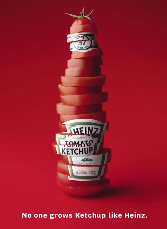
This is a ketchup ad by Heinz. Did you look twice at this bottle? Initially we see a tomato sauce bottle, but when we look closer it becomes clear the bottle is made up of tomato slices, communicating to the consumer this product uses fresh, real tomatoes. Once more this demonstrates how closure increases our attention to ads.
Principle of Continuity

Continuity is a state of stability and the absence of disruption, the unbroken and consistent existence of flow and progression of operation of something over time.
Tweet
Principle of Continuity states that elements that are arranged on a line or curve are perceived to be more related than elements not on the line or curve. It is seen when a line cuts through or in the middle of an object blending in with the font.
In the image above, for example, the red dots in the curved line seem to be more related to the black dots on the curved line than to the red dots on the straight horizontal line. That’s because your eye naturally follows a line or a curve, making continuation a stronger signal of relatedness than the similarity of colour.
The excellent examples of Principle of Continuity in brand Logos are:
Coca Cola
In the logo of the famous soft-drink brand, Coca Cola, our eyes follow the “C” from Coca to Cola, beginning from the “C” in the word Cola through L and A.
Amazon
In the logo of Amazon, there is an arrow starting from A and ending at Z which depicts that Amazon has everything from A to Z.
CNN
In the CNN logo the, the white midline, which ends with the curves of the alphabets, which portrays its multi-national presence and its commitment to provide uninterrupted news to people keep them connected 24/7.
Subway
The arrow pointing left in the S and the arrow point right in the Y of the Subway logo symbolize the entrance and exit of a Subway. It represents that you can have food on the way.
Related Posts
Gestalt Psychology and Its Impact on Consumer Behaviour: II – Proximity and Similarity
Gestalt Psychology and Its Impact on Consumer Behaviour: III – Figure & Ground
Gestalt Psychology and Its Impact on Consumer Behaviour: IV – Common Region and Symmetry & Order
Marketing Psychology and Consumer Behaviour

Murtaza Choolawala
Geologist, Marketer
Hi, I am Murtaza, an enthusiastic researcher. Always curious to learn new things and to connect with people. Tech and Marketing are my obsession, and Research and Analysis are my Passion.

3 thoughts on “Gestalt Psychology and Its Impact on Consumer Behaviour: I – Closure and Continuation”